Why Liquid Death's branding is murderously effective

Have you ever come across a brand whose name or visual design didn't seem to match the product? Maybe a company with a playful, colorful logo that sells something serious and professional, or a brand with a dull and generic name that markets a trendy and innovative product?
These mismatches carve out spots in our mind, but... why did they choose that name? Why does their logo look like that? What were they thinking?
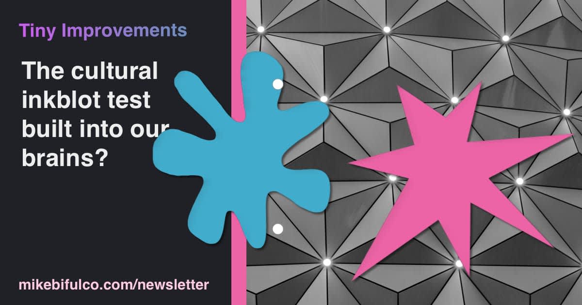
Humans have a natural tendency to associate certain shapes and sounds with specific meanings. This phenomenon is known as the Bouba/kiki effect, which refers to the fact that most people associate the round, curvy shape of the word "bouba" with a soft, gentle object, and the sharp, jagged shape of the word "kiki" with a hard, spiky object. This effect is not limited to word-sounds, but also applies to visual cues, such as colors, fonts, and images.
Sounds crazy, no? This was the conclusion of a study conducted by Wolfgang Köhler in 1929 - who asked people to to associate nonsense words like Kiki and Bouba to round or soft shapes. Research concluded that this phenomenon was repeatable, and is called sound symbolism. This ability was once essential for survival, as it allows us to quickly identify and avoid dangerous objects.
tl;dr: pointy thing scary, round thing soft.
Cultural expectations shape our perceptions of what certain things should be branded. For instance, we expect a luxury car brand to have a sophisticated and elegant name, a fast-food chain to have a short and catchy name, and a children's toy brand to have a fun and playful name. These expectations are not absolute, but they provide a useful framework for designing and naming brands that resonate with their target audiences.

Secure Your App Ideas and Make Them Yours: Prove Ownership and Increase Credibility with Our AI-Powered Idea Builder
Take the first step towards app success with our AI-enhanced idea builder. Own and protect your app ideas, and prove ownership with a shareable link. With a track record of progress, you can confidently discuss your ideas. Build with us today!
It's not a hard and fast rule
Sometimes, defying these expectations can be a smart strategy for creating a unique and memorable product or brand. Enter Liquid Death, a company that sells one of the most mundane products imaginable, canned water. Where 99% of companies in the world take the same beige market strategy for canned water, Liquid Death's approach is anything but dull. The company's name, logo, and packaging are edgy, irreverent (hi), and unexpected, with an unhinged aesthetic that appeals to a young, rebellious audience.
Their slogan is damn memorable, too: Murder your thirst.
This brand strategy allows Liquid Death to stand out from other water By challenging the conventions of what bottled water should look and sound like, Liquid Death has become an outright success, with a loyal following and a rapidly growing business.

So, what can we learn from this? When designing a brand, it's important to consider the industry and cultural expectations, but also to be willing to take risks and stand out from the crowd. By understanding the Bouba/kiki effect and using it to your advantage, you can create a visual and linguistic identity that resonates with your audience and sets you apart from the competition.
Who knows, you might just create the next Liquid Death.
Obliterate your curiosity
- 👨🚀 Creating a "similar posts" component in Astro. My pal Josh Finnie put together a super tidy tutorial for building a "similar posts" component in Astro. It's a great example of how Astro's simplicity-first approach makes it easy to build components.
- 🗺️ What3Words is a great example of a memorable product built by taking a fundamentally different approach to something we're all familiar with. The company's name is a reference to the fact that their service labels each location on Earth with a 3-word address. The words are chosen to be easy to remember, and are not associated with any particular meaning. For example, the most cursed place I've ever been to is
///hacker.plausible.bookshelf. - 🎥 Youtube channel LearnVue did a great video about regexp.dev, the library returns the humanity to regular expressions. It's a great example of how a simple, well-designed API can make a complex topic more accessible to a wider audience.
Blast your brain with these links
...or, put another way - here's some of the things from my corner of the internet this week
- A new APIs You Won't Hate Podcast with Anton Zagrebelny from Stigg. We had a great discussion about pricing strategy and structures for SaaS products, and the API that Stigg provides to make it easier for developers to experiment.
- I had the opportunity to interview Matt Biilmann from Netlify on Software Engineering Daily. We got into some of Netlify's announcements from the end of last year, and the company's approach to product development, and the future of the web.
- A new article from Craftwork: 8 Questions to Help Select Paint Colors. In a world with too many colors to choose from, it's no surprise that picking a color for your bathroom can be a crippling experience. We can help.