Ever catch yourself navigating around a clunky feature or long-standing bug in an app you use? Chances are, you're so used to it, you've forgotten it's a problem.
Guess what: Product teams feel the same frustration. I've been there myself, stuck in a cycle of building features that don't quite hit the mark.
Why does this disconnect between users and product teams exist? It boils down to a few common pitfalls:
- Emotional decision paralysis: Even minor changes feel overwhelming.
- Designers and PMs sometimes get emotionally wrapped in their work, making it hard to let go of past decisions, even when user behavior suggests they should.
- Corporate Red Tape: In large companies, decision-making can be painfully, heart-breakingly slow.
The way out of this cycle? Data. It helps us cut through the emotional and bureaucratic fog to make changes that actually matter.
Using data to make informed product decisions
At my company Craftwork, we've been using data to iterate on critical user paths and features. In particular our workflow for a self-serve, instant interior painting quote has gone through several iterations.
Although we haven't reached product design nirvana quite yet, we've learned a lot along the way. At its core, the process boils down to a couple critical steps:
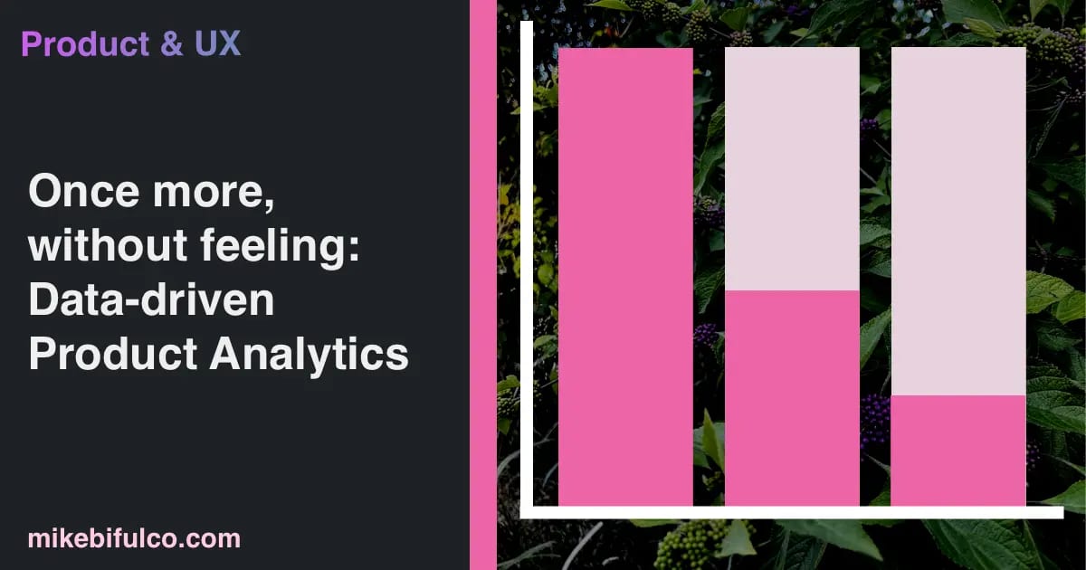
Understand signal and noise: Measuring Drop-off Rates
It's critical to understand how people are interacting with your product. This is where analytics tools come in handy. We use PostHog to track behavior. During the interior paint quote flow, there are a steps that we measure as inflection points for customer drop-off. At each point, we keep track of customer behaviors by logging an event.
For example, when a potential customer selects a room to paint, we log an event like this:
1posthog.capture('estimate/room-selected', { roomName: 'Living Room' });
We can then use PostHog to track the number of people who reach each step in the flow. As you might imagine, the first step in the process sees the most activity/ The very last step in the process is when someone clicks the submit button and sends us a request to have their home painted. In between the two, there are several steps that potential customers complete.

At each point in the timeline, we see two things: the number of people who continue to the next step, and the number of people who drop off.
This helps us understand where people are dropping off -- in other words, where we're losing potential customers. At each of these steps, there's an opportunity to improve conversion rates by iterating on our design.
One Step at a Time: Hypothesis-Driven Iterations
This gives us data to make informed decisions about the product without getting too wrapped up in what we feel should change. For example, if we see a lot of people dropping off at the step where they select paint colors, we might try a few things:
- Reduce the number of colors to choose from
- Add a "recommended" color
- Remove the color selection step entirely
(Any guesses what we landed on? If you're in Charlotte, NC, you can try it out and see for yourself!
We can then the impact of each change by seeing how the drop-off rate at that step is affected. If we see a significant improvement in drop-off rate, we know we're on the right track.
If not, we can try something else.
This is a simple example, but it illustrates the power of data-driven decision making. Ideally, this is paired with hands-on user research, and learnings from both proactive and reactive customer support. But even with a small team, you can make a big impact by using data to inform your product decisions.
Tools for product analytics
- As mentioned above, we use PostHog to track critical user behaviors, and to build funnels for measuring drop-off rates.
- Highlight pitches itself as a full-stack monitoring platform. It's handy for keeping an eye on errors and performance issues within your app, and is completely self-hostable.
- Fathom Analytics (that's a referral link for $10 off your first invoice) - I've written about fathom several times now, and I stand by my recommendation. It's great!
More from my slice of the internet this week
- 🎙️ Making React 70% faster with Aiden Bai of Million.js - I had a chat with Aiden recently for an episode of the Software Engineering Daily podcast. Aiden is a recent high school grad who's built a React alternative that's 70% faster than React. ...I know, right?!
- 🧸 Smartbear Acquires Stoplight - the most recent newsletter from APIs You Won't Hate talks about a recent acquisition in the API devtools world.